Visualizing synthetic quantification data#
make_quantification builds one labelled population
and draws bags from it, returning each bag’s features, labels, and — crucially
for quantification — its true class prevalence. Before looking at shifts and
quantifiers, it helps to simply see the data.
Asking for two informative features (n_features=2, n_redundant=0) makes the
population directly plottable: below is a single bag, with each point coloured by
its class.
import numpy as np
import matplotlib.pyplot as plt

from mlquantify.datasets import make_quantification

Xs, ys, prevs = make_quantification(
    n_batches=1, batch_size=800, n_classes=2,
    n_features=2, n_redundant=0, class_sep=1.6, random_state=0,
)
X, y = Xs[0], ys[0]

fig, ax = plt.subplots(figsize=(6, 5))
for k, color in enumerate(["#2a9d8f", "#e76f51"]):
    mask = y == k
    ax.scatter(X[mask, 0], X[mask, 1], s=14, alpha=0.7,
               color=color, label=f"class {k}")
ax.set_xlabel("x1")
ax.set_ylabel("x2")
ax.set_title(f"One synthetic bag — prevalence = {np.round(prevs[0], 2)}")
ax.legend()
fig.tight_layout()
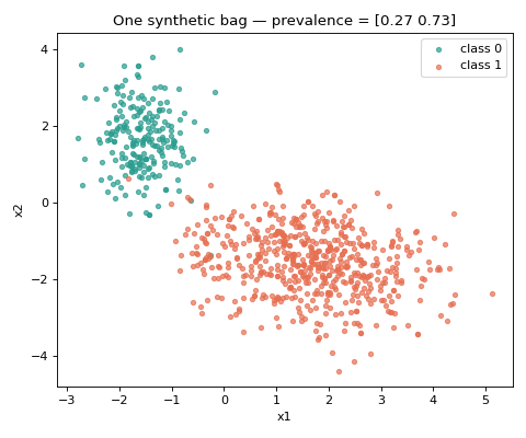
The call returns Xs, ys, prevs: lists of per-bag feature matrices and label
vectors, plus the (n_bags, n_classes) array of true prevalences. With three
informative features you would see three clusters; everything that follows uses
the same generator, just sampled differently.
Note
In real experiments you keep all 20 (or more) features — n_features=2 is
only to make the population visible. The quantification behaviour is the same.
See also
Prior shift, bag by bag — how the bags change under prior shift.
Controlling prevalence variability across bags — controlling the bag-to-bag variability.