Comparing quantifiers with diagonal plots#
A diagonal plot is the standard way to compare quantifiers: run an
APP (Artificial Prevalence Protocol) to
generate many test samples spanning the whole prevalence range, then scatter the
predicted prevalence against the true one. Points hugging the \(y = x\) line
mean low bias; a tight cloud means low variance.
Here we compare one method from each major family — counting
(ACC), the EM likelihood method
(EMQ), distribution matching
(DyS), and plain CC
as a baseline — using DiagonalDisplay.
import matplotlib.pyplot as plt
from sklearn.datasets import make_classification
from sklearn.linear_model import LogisticRegression

from mlquantify.counting import CC, ACC
from mlquantify.likelihood import EMQ
from mlquantify.matching import DyS
from mlquantify.model_selection import apply_protocol
from mlquantify.visualization import DiagonalDisplay

X, y = make_classification(
    n_samples=4000, n_features=20, weights=[0.5, 0.5], random_state=0,
)

methods = {
    "CC": CC(LogisticRegression(max_iter=1000)),
    "ACC": ACC(LogisticRegression(max_iter=1000)),
    "EMQ": EMQ(LogisticRegression(max_iter=1000)),
    "DyS": DyS(LogisticRegression(max_iter=1000)),
}

fig, axes = plt.subplots(2, 2, figsize=(9, 9))
for (name, q), ax, color in zip(
    methods.items(), axes.ravel(),
    ["#e76f51", "#2a9d8f", "#264653", "#e9c46a"],
):
    results = apply_protocol(
        q, X, y, protocol="app",
        n_prevalences=21, repeats=5, batch_size=100, random_state=0,
    )
    DiagonalDisplay.from_predictions(
        results["true_prevalences"], results["predicted_prevalences"],
        ax=ax, color=color, alpha=0.5, s=18,
    )
    ax.set_title(name)
fig.suptitle("Diagonal plots across quantifier families", y=0.99)
fig.tight_layout()
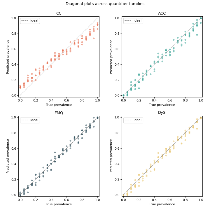
Read the panels like this: CC’s cloud tilts off the diagonal (bias under shift),
while ACC, EMQ and DyS each pull their estimates back toward the ideal line in
their own way. Swapping in any other method from
mlquantify.counting, mlquantify.matching or
mlquantify.likelihood is a one-line change.
See also
Robustness to prior-probability shift — collapse each panel into a single error curve.
Visualization — the full Display gallery.