Class separability and label noise#
How hard is the quantification problem? Two make_quantification knobs
control that directly: class_sep (how far apart the class clusters sit) and
flip_y (how much label noise is injected). They set the ceiling on how well
any method can do, so they are worth understanding before comparing
quantifiers.
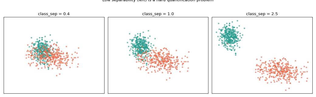
First, what class_sep does to the feature space:
import matplotlib.pyplot as plt

from mlquantify.datasets import make_quantification

fig, axes = plt.subplots(1, 3, figsize=(13, 4), sharex=True, sharey=True)
for ax, sep in zip(axes, [0.4, 1.0, 2.5]):
    Xs, ys, _ = make_quantification(
        n_batches=1, batch_size=700, n_features=2, n_redundant=0,
        prevalence=[[0.5, 0.5]], class_sep=sep, random_state=0,
    )
    X, y = Xs[0], ys[0]
    for k, color in enumerate(["#2a9d8f", "#e76f51"]):
        mask = y == k
        ax.scatter(X[mask, 0], X[mask, 1], s=10, alpha=0.6, color=color)
    ax.set_title(f"class_sep = {sep}")
    ax.set_xticks([])
    ax.set_yticks([])
fig.suptitle("Low separability (left) is a hard quantification problem", y=1.02)
fig.tight_layout()
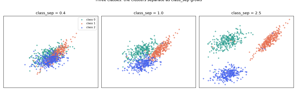
The same picture for three classes — each cluster keeps its own colour, and
make_quantification handles the extra class with no change to the call
(n_classes=3):
import matplotlib.pyplot as plt

from mlquantify.datasets import make_quantification

fig, axes = plt.subplots(1, 3, figsize=(13, 4), sharex=True, sharey=True)
for ax, sep in zip(axes, [0.4, 1.0, 2.5]):
    Xs, ys, _ = make_quantification(
        n_batches=1, batch_size=900, n_classes=3, n_features=2,
        n_redundant=0, prevalence=[[1 / 3, 1 / 3, 1 / 3]],
        class_sep=sep, random_state=3,
    )
    X, y = Xs[0], ys[0]
    for k, color in enumerate(["#2a9d8f", "#e76f51", "#4361ee"]):
        mask = y == k
        ax.scatter(X[mask, 0], X[mask, 1], s=10, alpha=0.6,
                   color=color, label=f"class {k}")
    ax.set_title(f"class_sep = {sep}")
    ax.set_xticks([])
    ax.set_yticks([])
axes[0].legend(loc="best", fontsize="small")
fig.suptitle("Three classes: the clusters separate as class_sep grows", y=1.02)
fig.tight_layout()
Note
make_classification (which make_quantification builds on) draws each
class with its own random covariance, so some clusters come out rounder and
others more elongated. With only two features that shape is fully visible; in
a higher-dimensional run it is spread across the extra dimensions. The bags
here also use a balanced prevalence, because a single prevalence="uniform"
draw can be strongly imbalanced and leave one class with very few points.
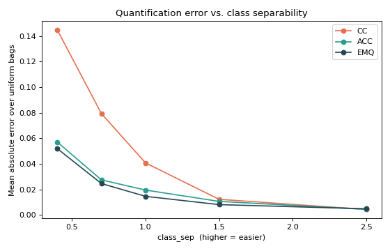
Now the consequence: sweeping class_sep and measuring the mean absolute
error of three quantifiers over a uniform set of bags. As the classes separate,
the underlying classifier sharpens and every method improves — but the
adjusted methods stay ahead when the problem is hard.
import numpy as np
import matplotlib.pyplot as plt
from sklearn.linear_model import LogisticRegression

from mlquantify import set_config
from mlquantify.datasets import make_quantification
from mlquantify.counting import CC, ACC
from mlquantify.likelihood import EMQ

set_config(prevalence_return_type="array")   # predictions come back as arrays

seps = [0.4, 0.7, 1.0, 1.5, 2.5]
methods = {"CC": CC, "ACC": ACC, "EMQ": EMQ}
curves = {name: [] for name in methods}

for sep in seps:
    Xtr, ytr, Xs, ys, prevs = make_quantification(
        n_batches=120, batch_size=200, return_train=True,
        train_prevalence=[0.5, 0.5], prevalence="uniform",
        n_features=2, n_redundant=0, class_sep=sep, random_state=0,
    )
    for name, Method in methods.items():
        q = Method(LogisticRegression(max_iter=1000)).fit(Xtr, ytr)
        pred = np.vstack([q.predict(Xb) for Xb in Xs])
        curves[name].append(float(np.mean(np.abs(pred - prevs))))

fig, ax = plt.subplots(figsize=(7, 4.5))
for (name, vals), color in zip(curves.items(), ["#e76f51", "#2a9d8f", "#264653"]):
    ax.plot(seps, vals, "o-", color=color, label=name)
ax.set_xlabel("class_sep  (higher = easier)")
ax.set_ylabel("Mean absolute error over uniform bags")
ax.set_title("Quantification error vs. class separability")
ax.legend()
fig.tight_layout()
This is the controlled setting that makes make_quantification useful: you can
hold everything fixed and vary one source of difficulty at a time — separability
here, label noise via flip_y, or sample size via batch_size.
See also
Benchmarking quantifiers on synthetic bags — the per-bag diagonal view of the same methods.